Svelte UI refresh
A comprehensive design refresh with a new theme system and UI refinements.
A comprehensive design refresh with a new theme system and UI refinements.
With the SvelteKit UI rewrite behind us, we turned our attention to something we have been wanting to do for a long time: give Sourcegraph a cohesive, modern visual identity. Over the course of this release cycle, we rebuilt the color and design token system, introduced a new vertical navigation, and made hundreds of refinements across every surface of the product.
With this release, we are rolling out new vertical sidebar navigation, a redesigned page layout and file tree, fully consistent light and dark themes, and the technical foundations for even more exciting changes.
The horizontal navigation bar has been replaced with a collapsible vertical sidebar. This frees up vertical space for code and gives the navigation room to grow as we add more features.
The main content area and file tree have been redesigned for a cleaner, more structured look. The file tree now features indentation guides, animated expand/collapse transitions, and improved nesting indicators. Sidebar panels are resizable, with cleaner header styles and active state indicators.
This new tokenization system is what makes light and dark mode work cleanly across the entire product. The systematic approach — where every color, spacing value, and shadow is defined once and referenced everywhere — means both themes are fully consistent without any per-component overrides.
The same foundation also opens the door to more customization options in the future. Adding a new theme is now a matter of defining a single token file rather than hunting through thousands of lines of CSS.
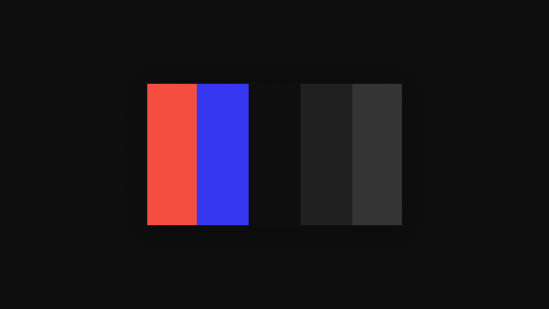
The previous UI relied on an inconsistent mix of hardcoded colors, Bootstrap variables, and ad-hoc tokens that had accumulated over years. We replaced all of it with a systematic design token architecture built on modern CSS capabilities.
The new system is organized into three layers:

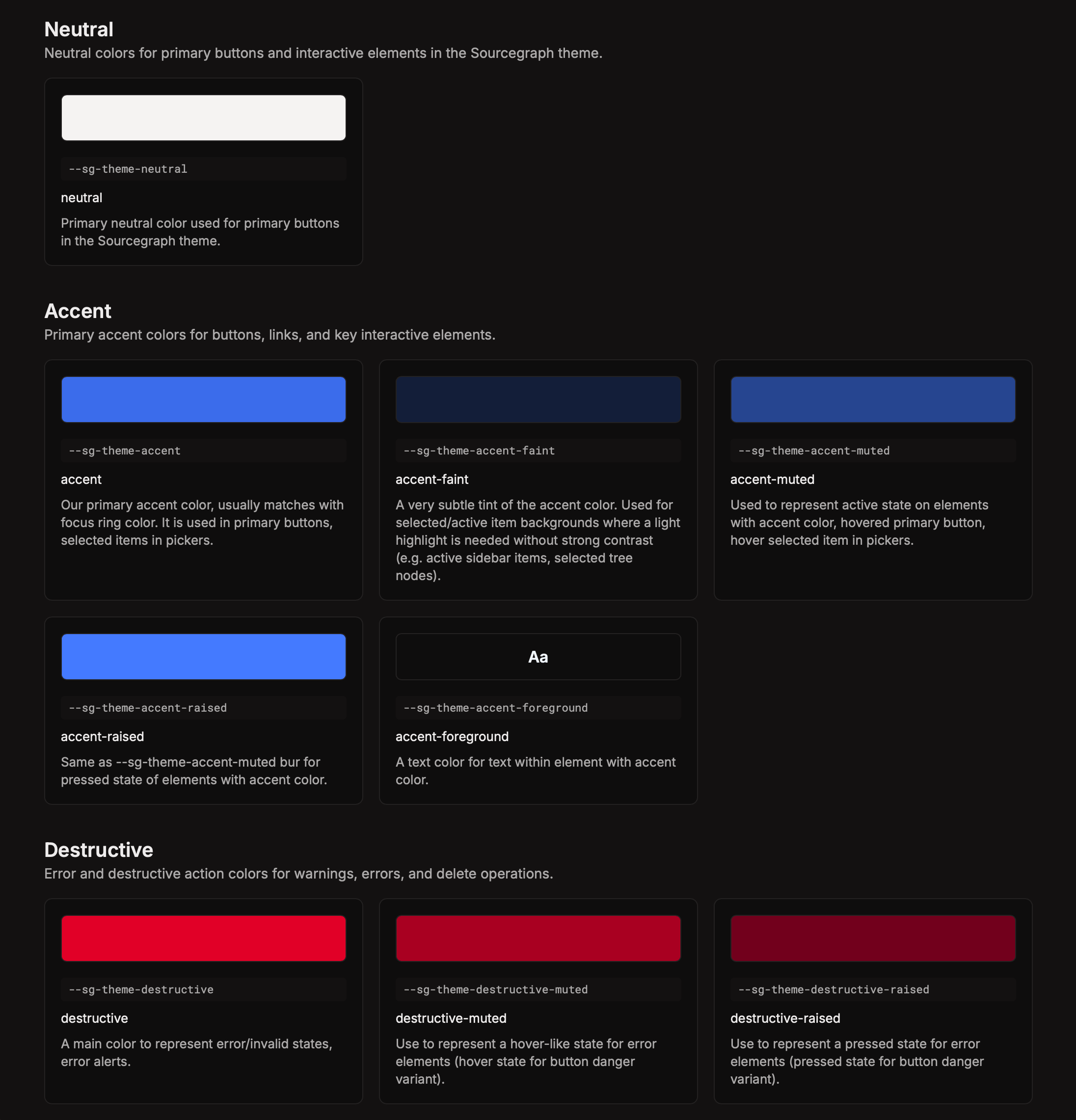
We also refined the overall color palette — shifting to cooler accent tones and adjusting contrast across backgrounds, borders, and text. This is very much a starting point: readability and accessibility aren't something we've fully solved yet, and we know there are still rough edges across the product. The new token system gives us a much better foundation to keep improving consistently, and that work is ongoing.